City of Penticton
-
RoleBrand Strategist
-
Year2023
-
Website
Approach
(Est. 1948),The City of Penticton is in the Okanagan Valley of southern British Columbia. This project offers a redesigned brand identity for the city of Penticton. Design highlights the organic and sustainable root of the city with a coherent design system throughout the digital and physical environment.
Tools
Adobe Photoshop, Adobe Indesign, Adobe Illustrator, Figma
Brand Strategy Process
"Designed for Sustainable and Organic Penticton"
1. Research & Discovery: Studied Penticton's identity, values, and future goals
2. Audience Insights: Mapped how residents, visitors, and staff engage with the brand.
3. Brand Positioning: Framed the city as sustainable, community-first, and nature-driven.
4. Design System: Built a flexible visual system for both digital and physical use.
5. Cross-Platform Strategy: Ensured consistency across signage, web, and city materials
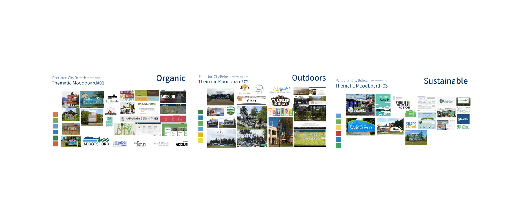
Thematic Moodboards
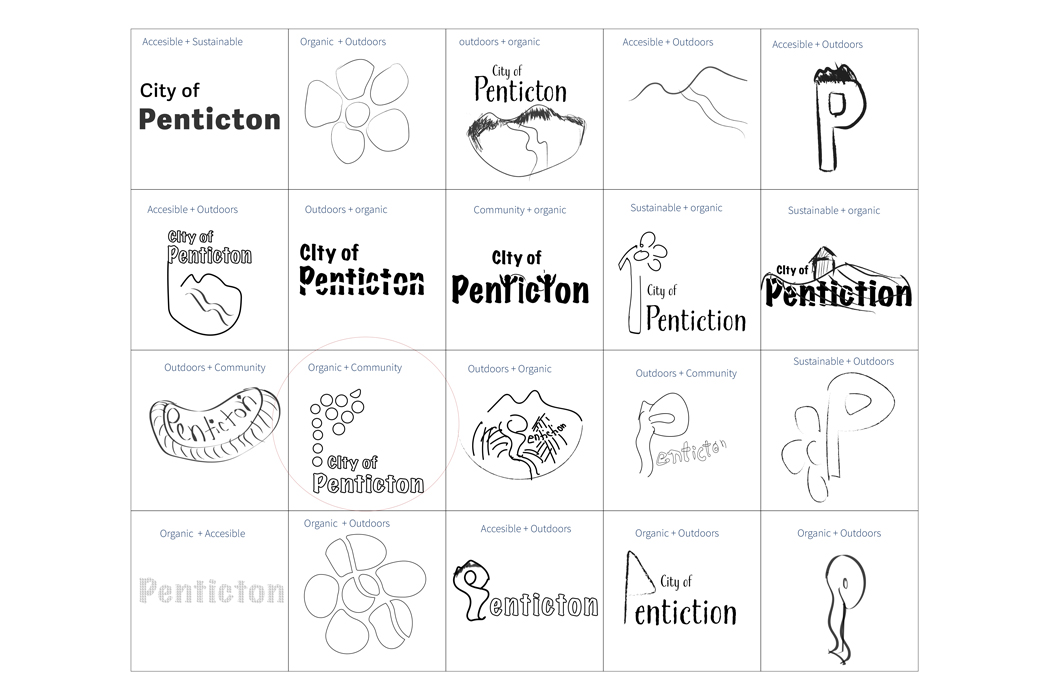
Logo Ideation
Phase #1 - Rough Sketches
Phase #2 - Concept Selection to finalizing logo
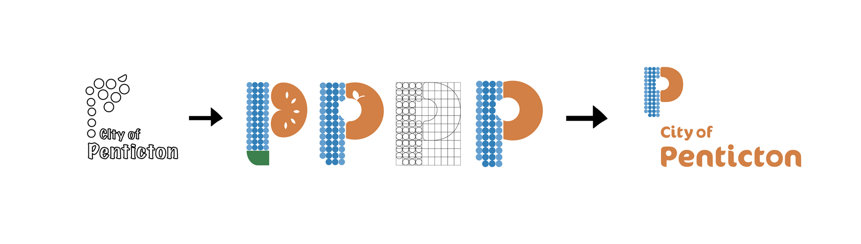
Redesigned logo
Design System
Social Media Ads
Street Banners
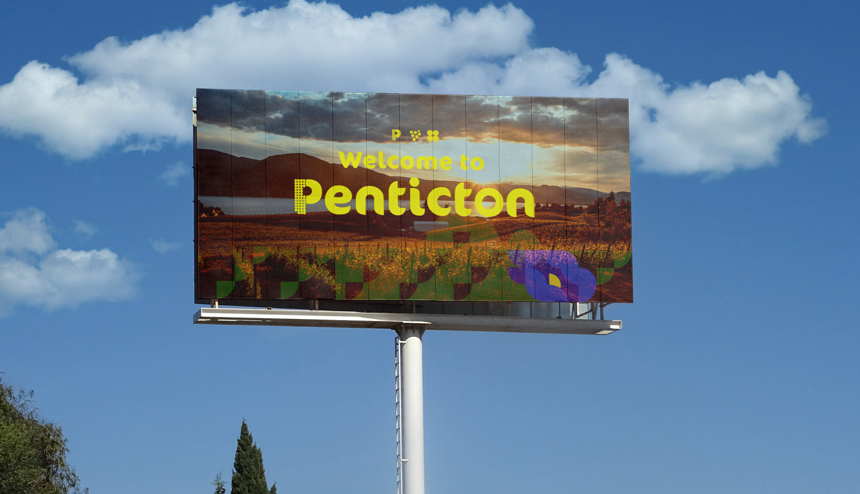
Billboard
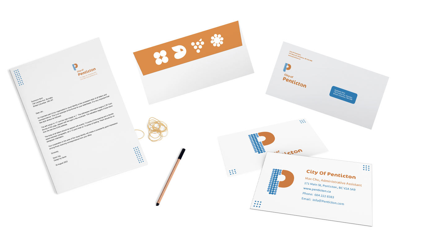
Stationery
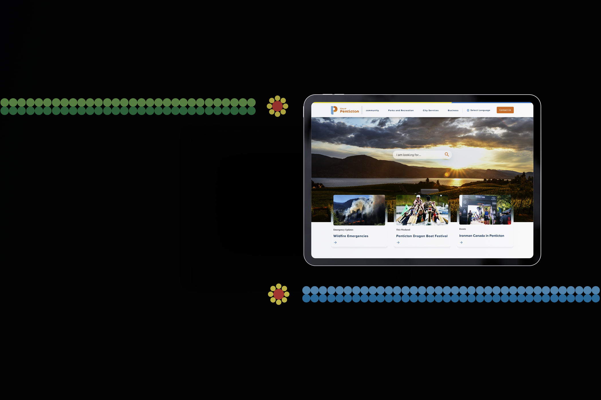
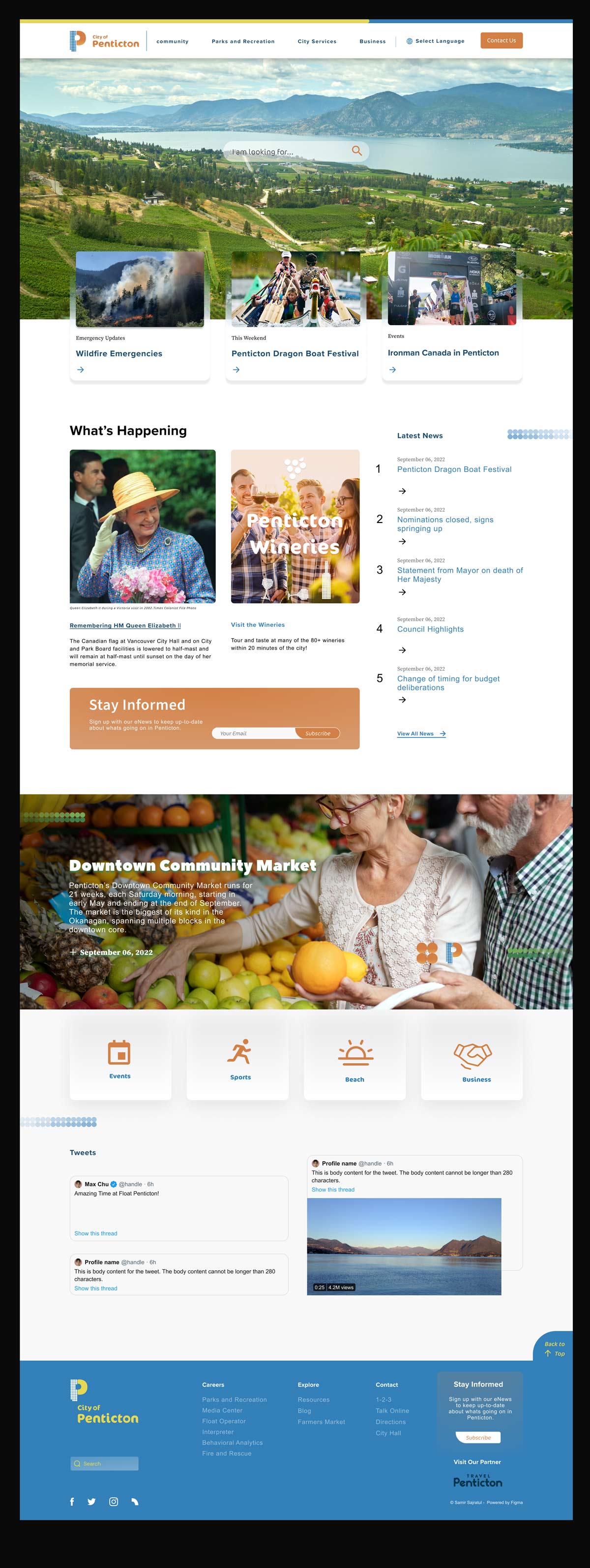
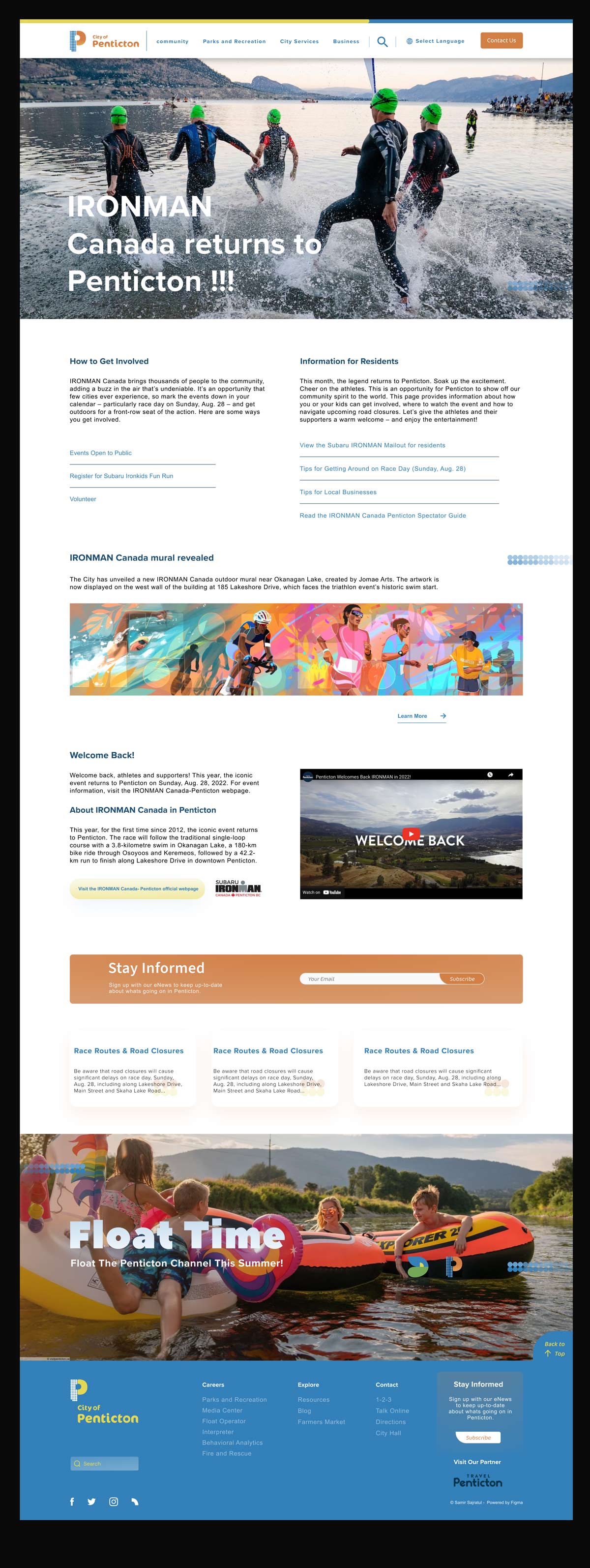
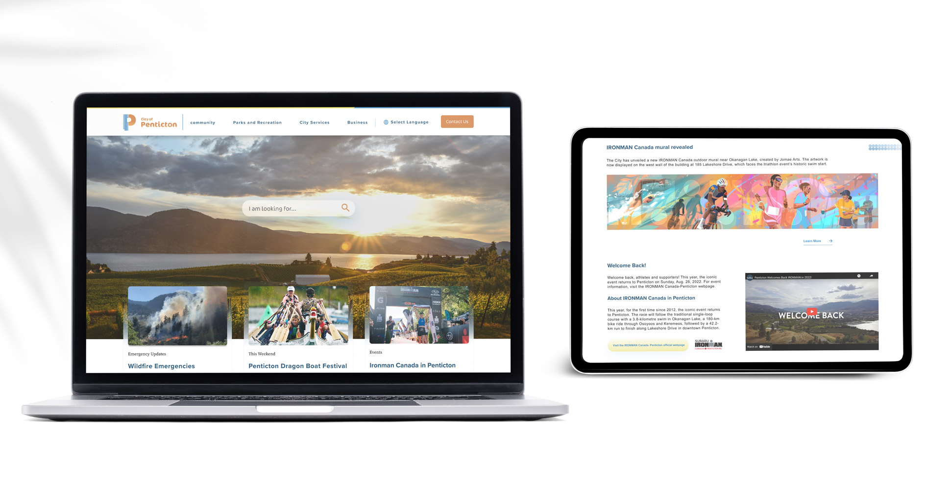
Website Main pages
Home Page | 1.0.1
Content Page | 1.0.2
Results
A flexible, unified system that reflects Penticton's sustainable identity. It works seamlessly across digital and physical touchpoints, improving consistency, accessibility, and stakeholder alignment. The system supports clear communication while adapting to diverse contexts—from city signage to web platforms.