Approach
The design focuses on a bold identity that embodies freshness, speed, and health. By leveraging research insights, we crafted a logo, color palette, and typography for instant recognition and cross-platform adaptability. The mobile-first UI kit and responsive website prioritize seamless navigation, ensuring a fast, user-friendly experience both online and in-store.
Tools
Adobe Photoshop, Adobe Illustrator, Miro, Hotjar, Figma
Brand Strategy Process
1. Audience Research: Identified health-conscious, fast-paced urban eaters in East Hastings.
2. Positioning: Framed LoMein as fresh, fast, and flavorful—healthy food made quick.
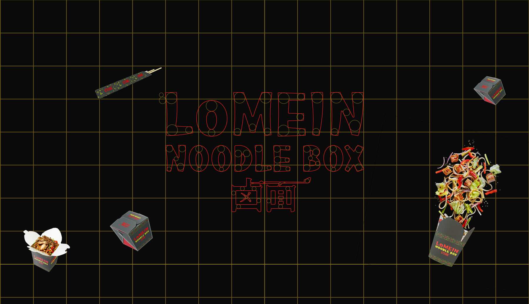
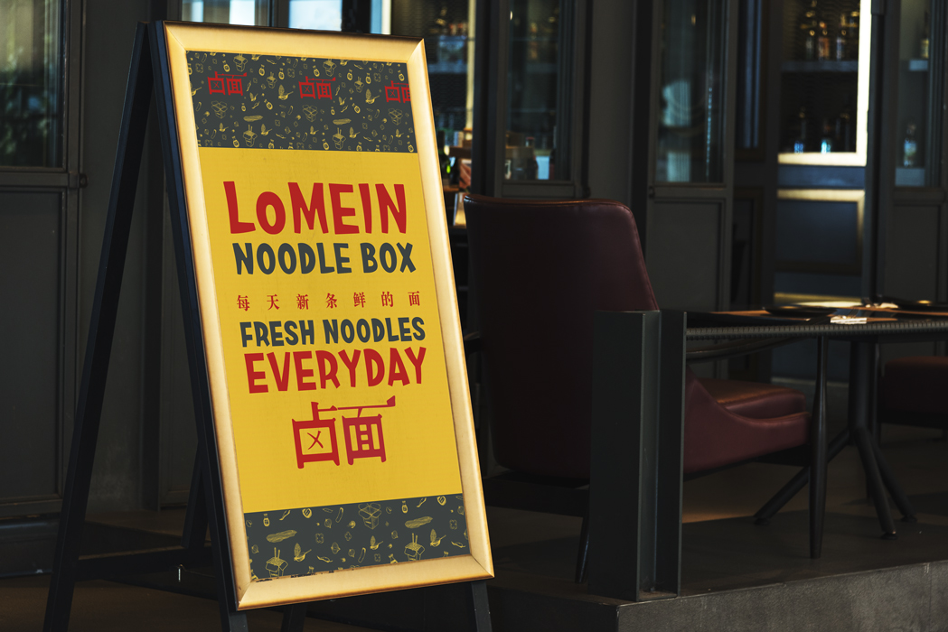
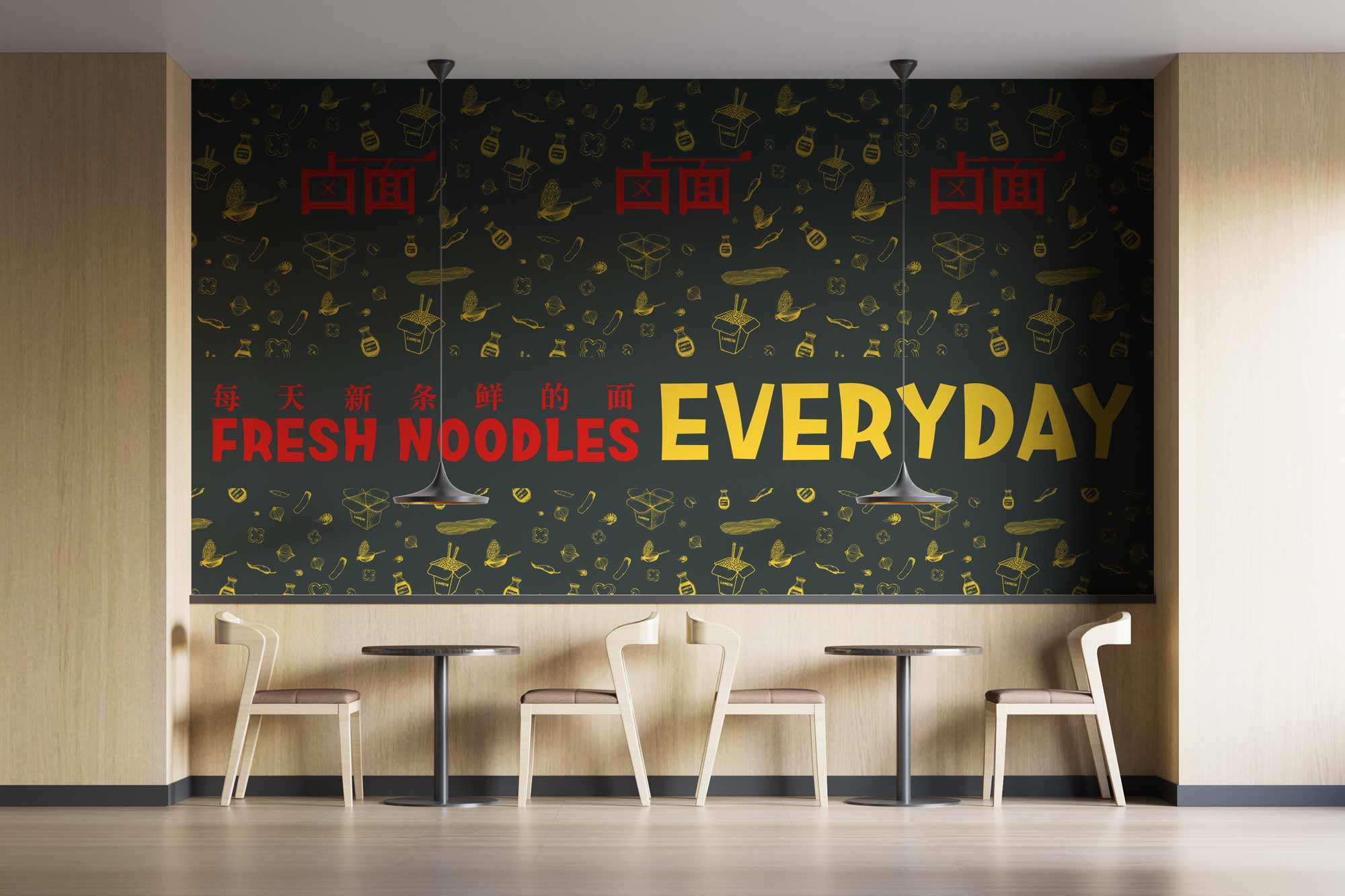
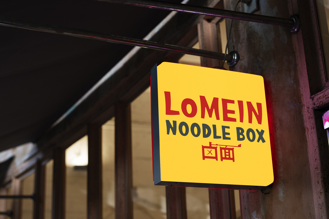
3. Visual Identity: Bold, vibrant look with clean type and a heirloom inspired logo.
4. UX & UI Design: Built a mobile-first interface for easy, fast ordering.
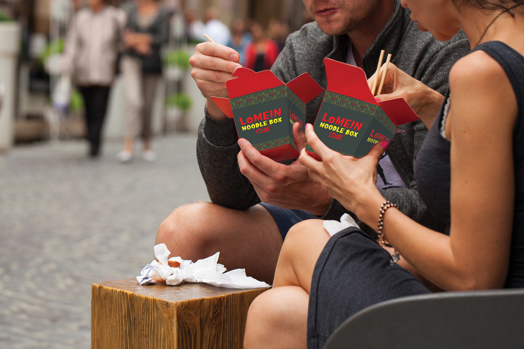
5. Brand Touchpoints: Applied the system across packaging, store visuals, and digital promos for a cohesive experience.
Research & Ideation
Ideation started with secondary research into the location of the restaurant, East Hastings, Vancouver. After that 16 interviews and a survey of 120 people were conducted to establish the concept addressing local eaters' need.
Define
Lomein Noodle box serves fresh and authentic dishes in a consistently fast paced service to their customer. They prioritize convenience of their customer and promote healthy eating while being true to their heirloom.
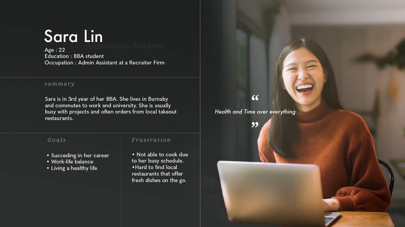
User Persona
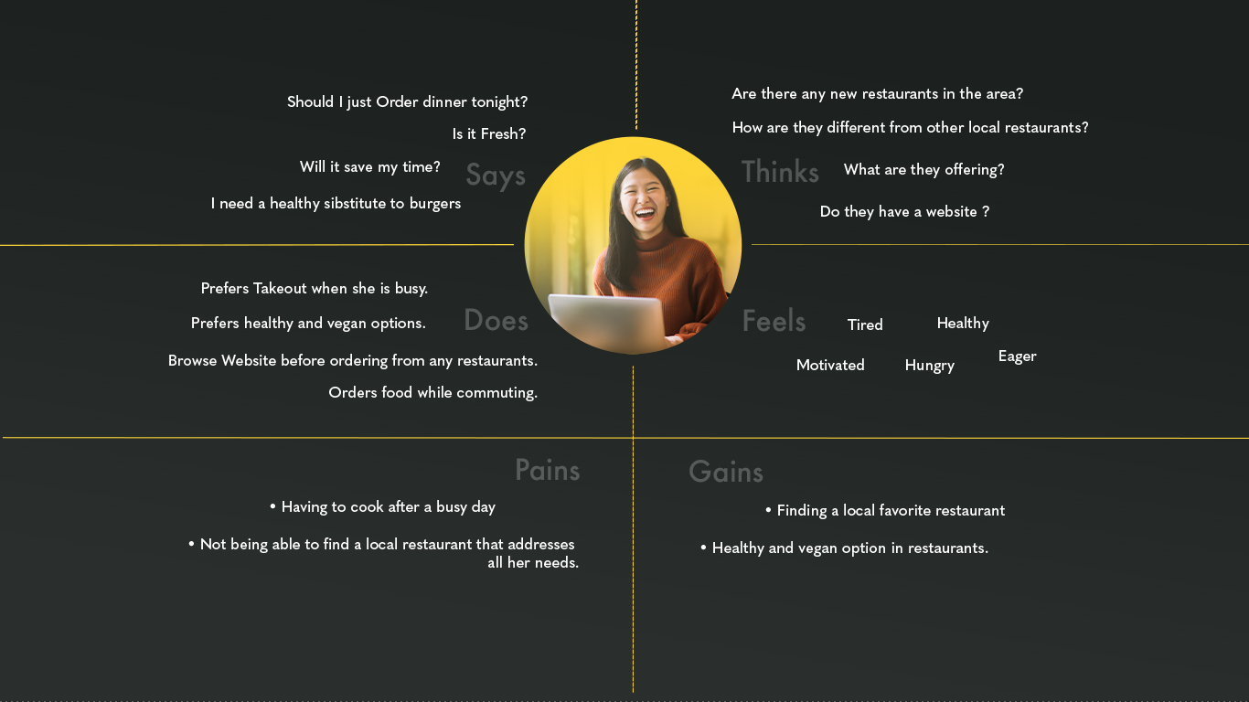
Empathy Map
Vision
Creating a health conscious community of eaters who believe eating healthy can be fast too
Slogan
"Fresh Noodles Everyday"
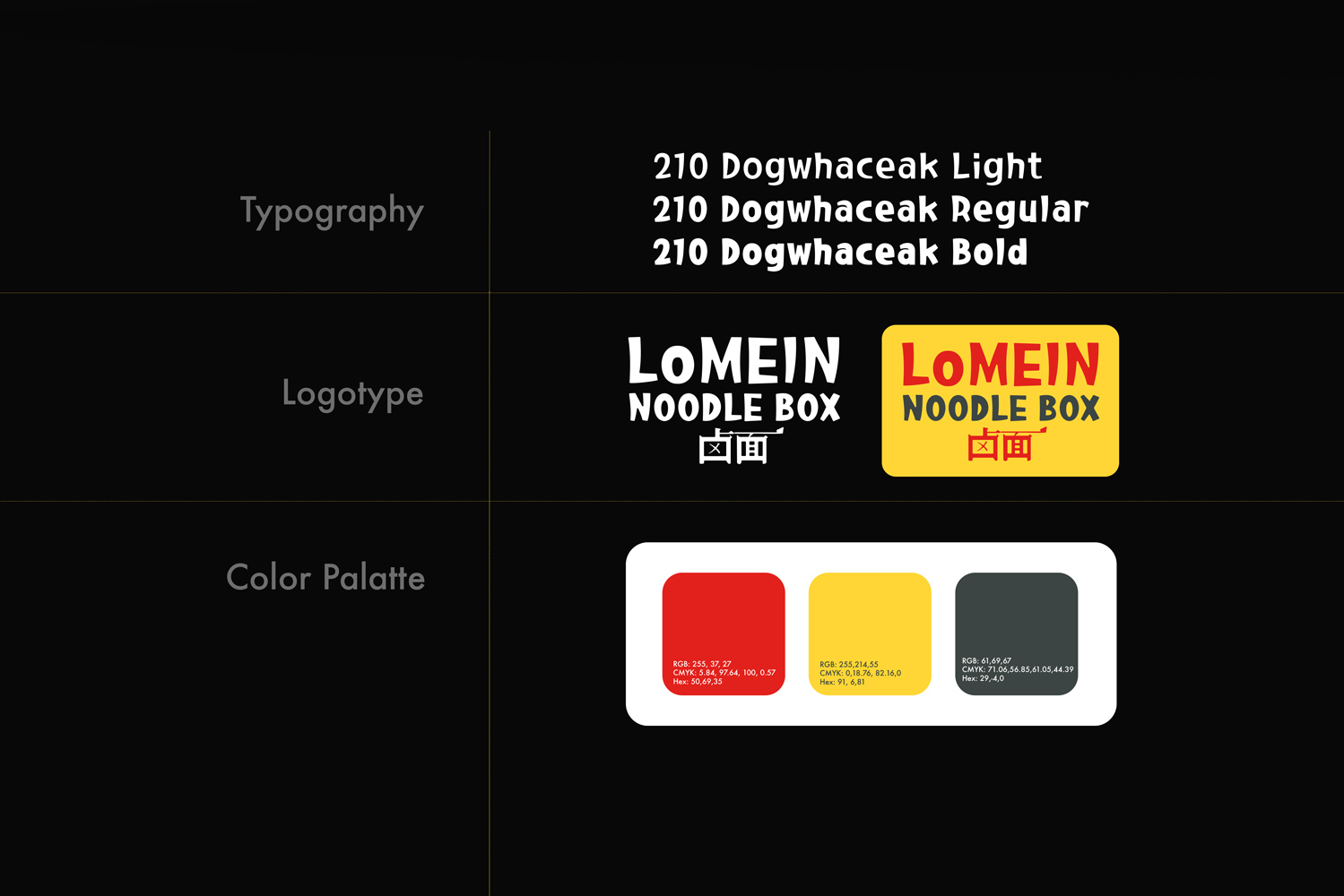
Design System
Design Implementation
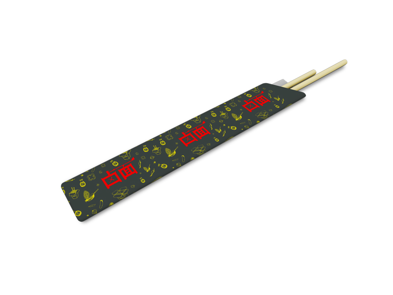
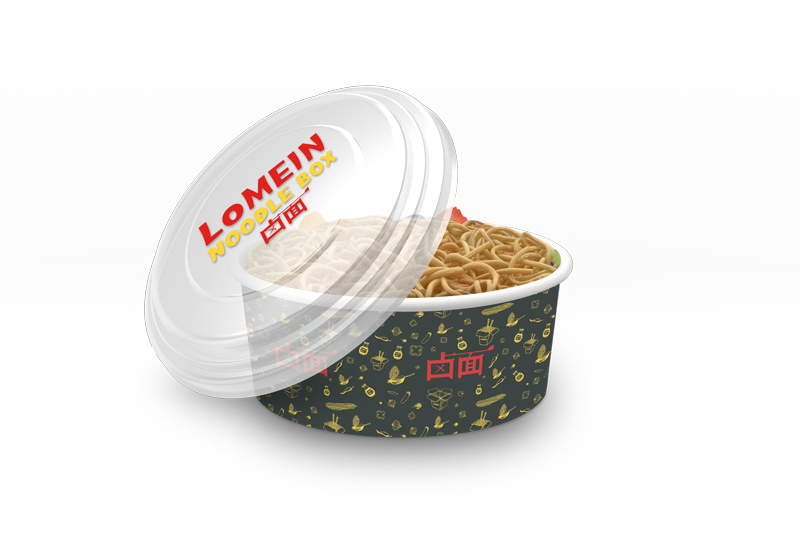
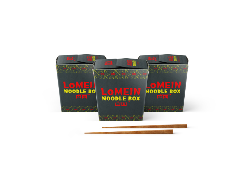
Packaging and Environmental Designs
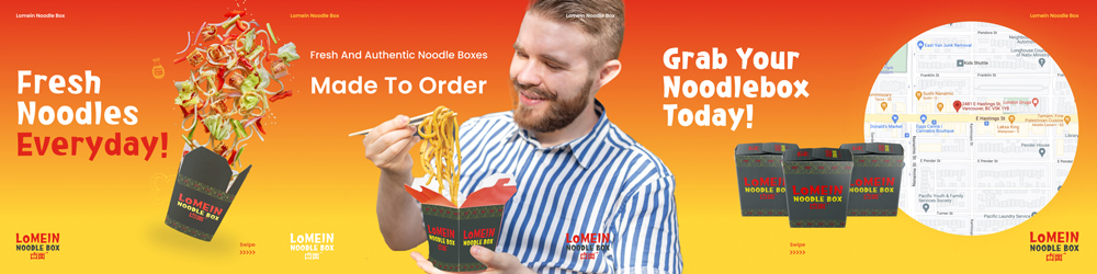
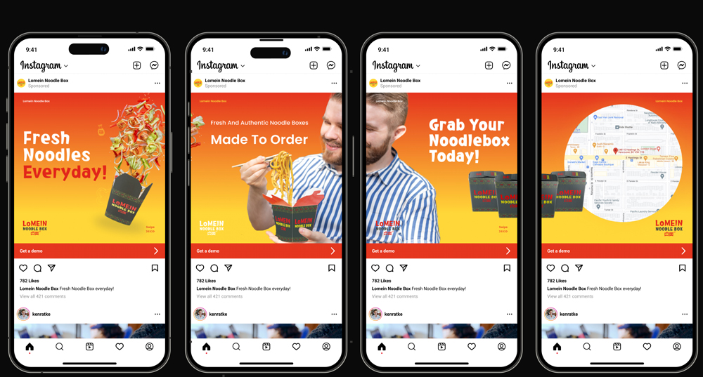
Social Media Ad
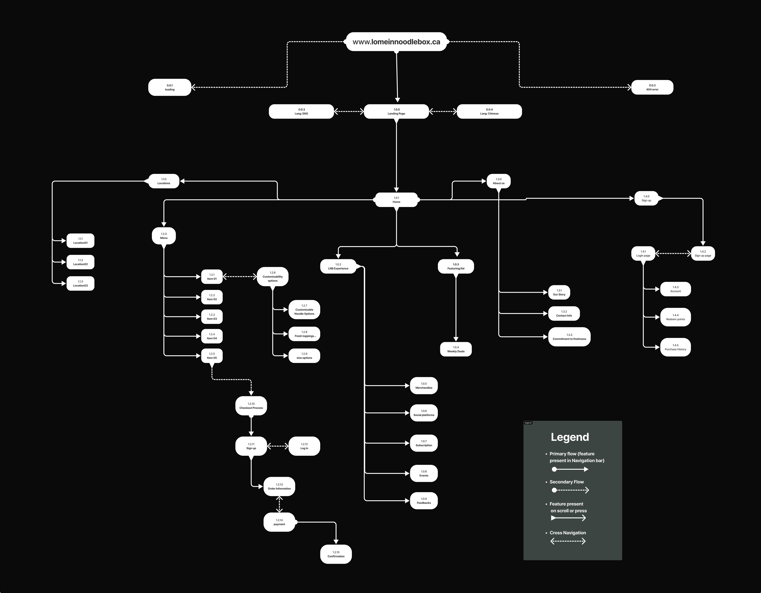
Website Flowchart
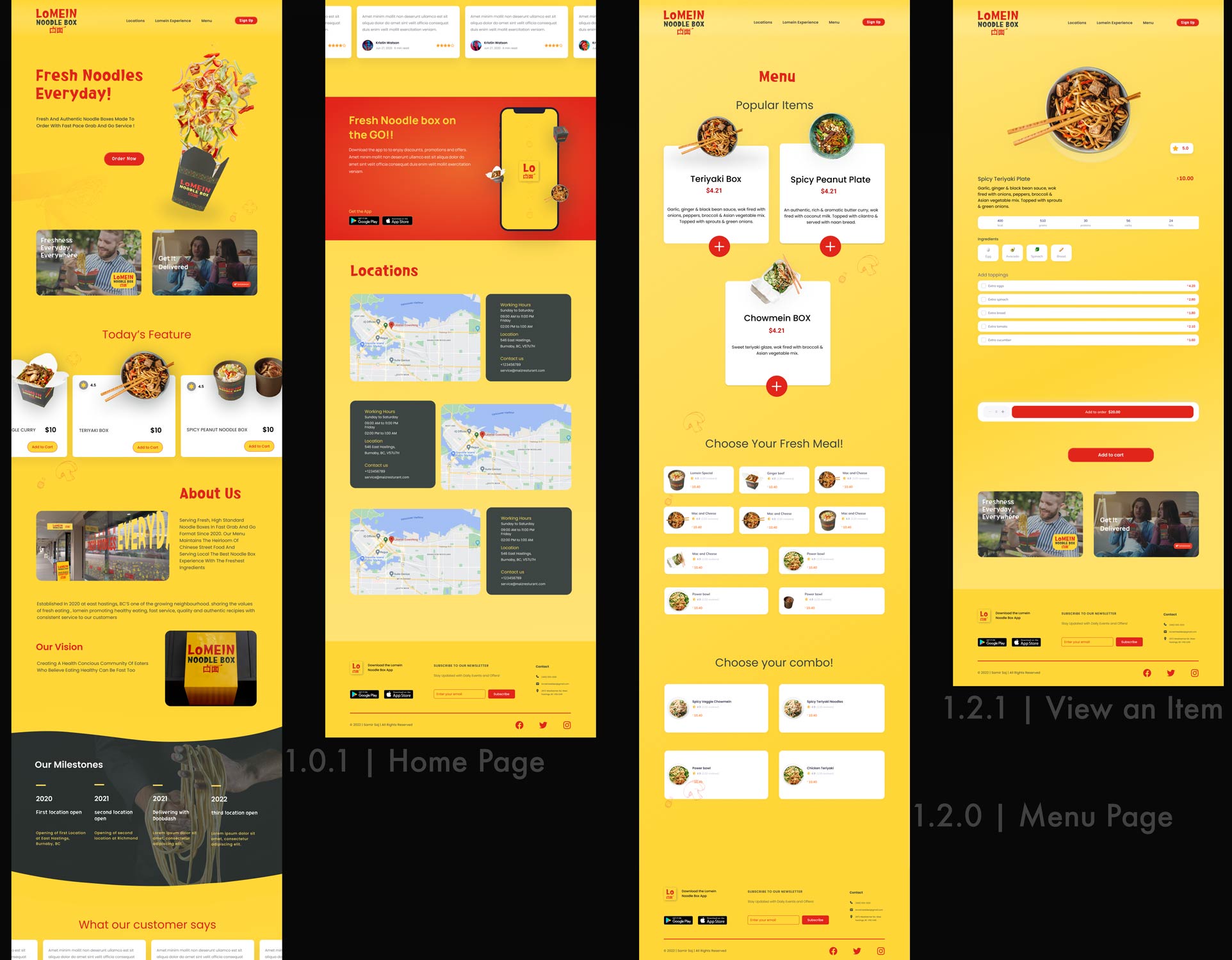
Main Pages
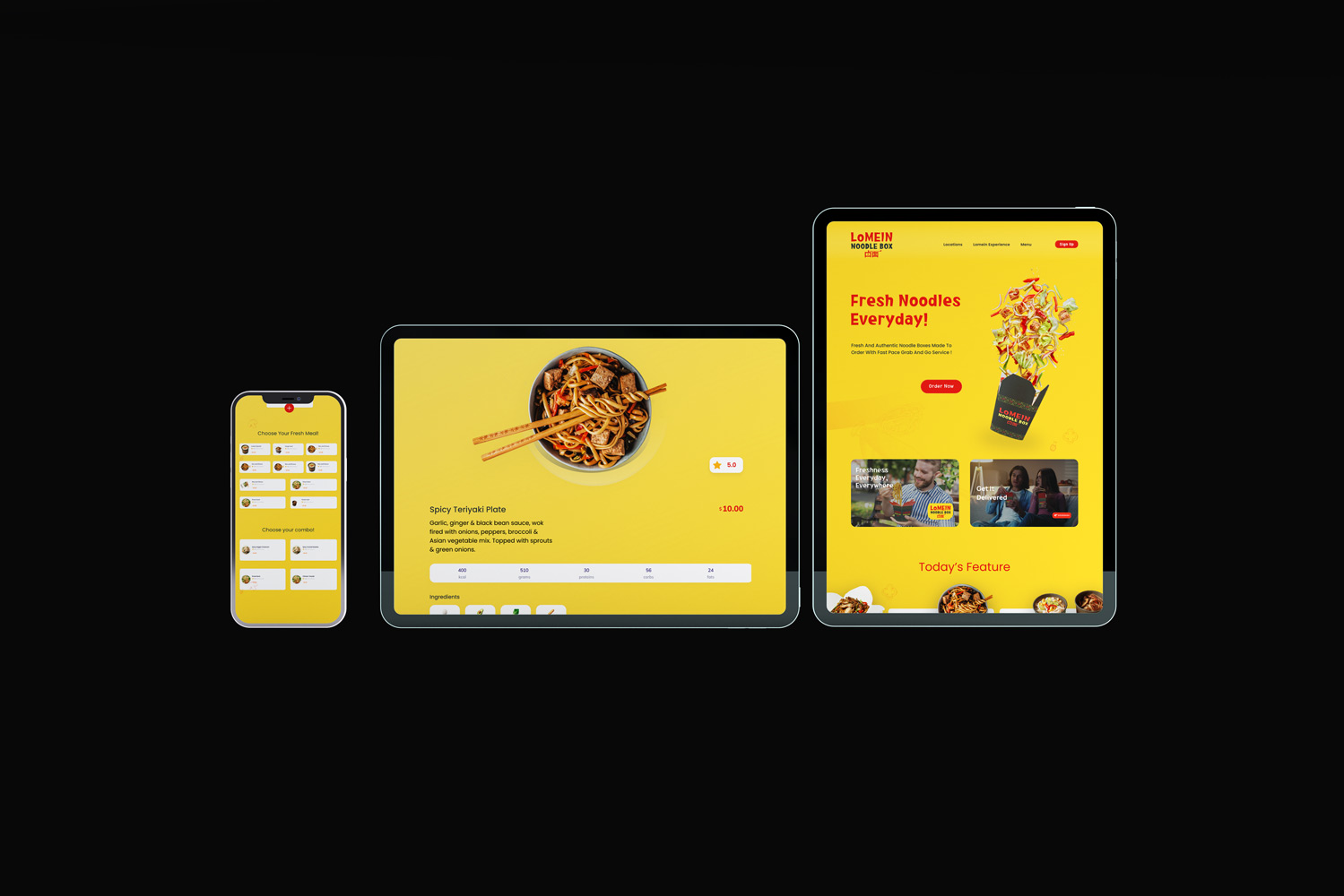
Website Prototype
link to prototypes - Tablet + Desktop
Results
Data driven, modern, consistent identity across all touchpoints, with a responsive website that enhances user experience and brand presence. Includes, logo Design, Environmental Design, Packaging, Promo Kit, Responsive Website